Prompt → Design
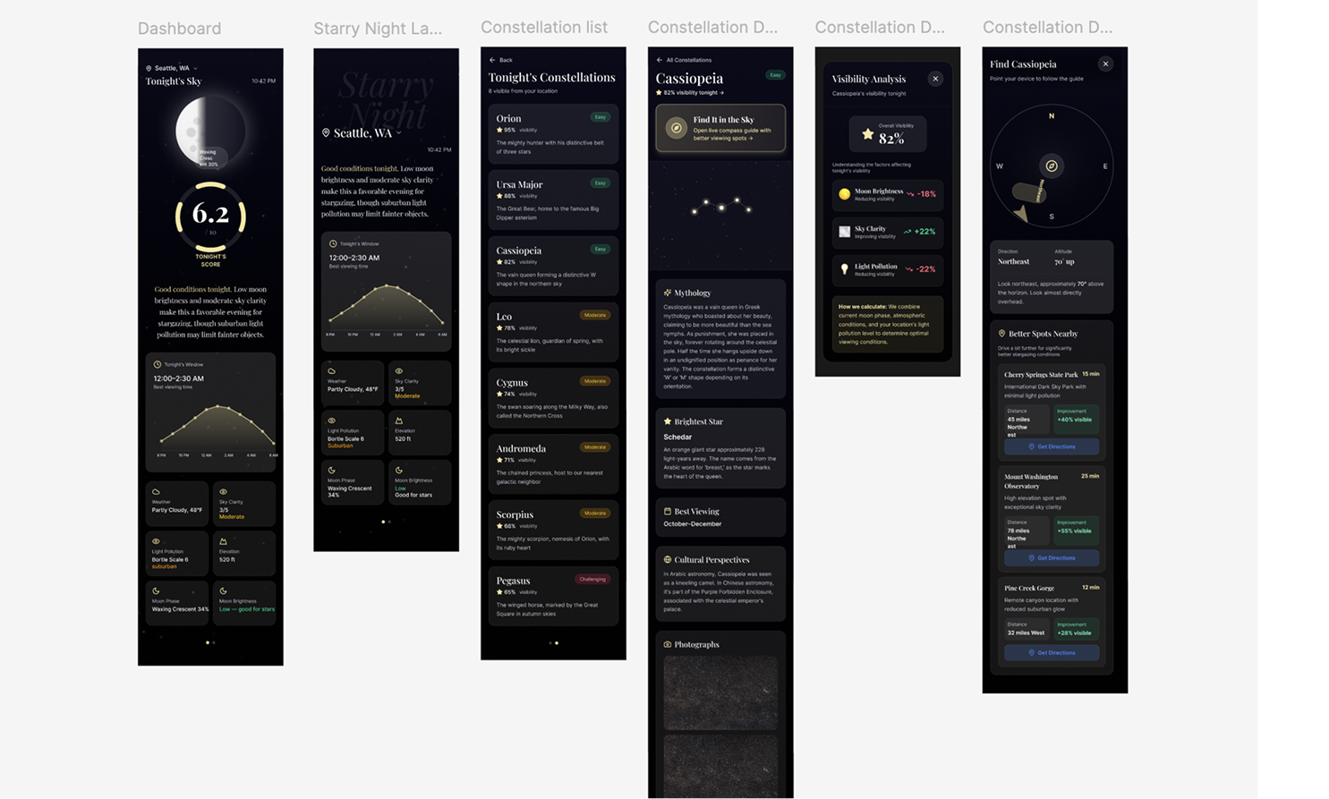
Designing the star-gazing app UI in Figma Make, using AI for the feature list and the prompts, and my own judgment to decide what stays.
With the data layer from Project 02 defined, the next question was: what does this app actually do? I started with the basics: check conditions, figure out the best constellation to see, tell users when to go. That felt like a reference tool. I wanted it to be more useful than that, so I went back to ChatGPT and asked for a feature list. It came back with a lot. I picked what mattered.
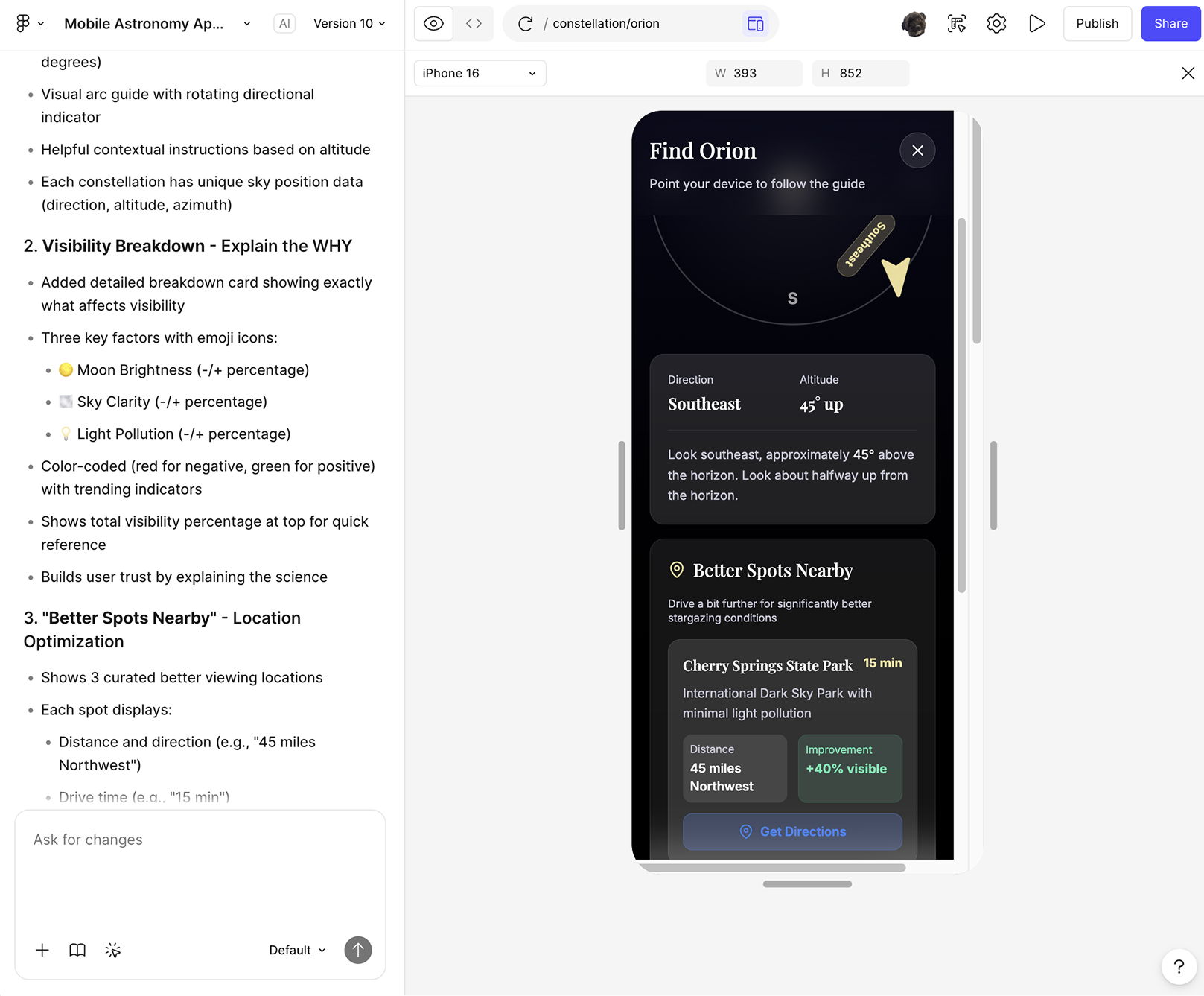
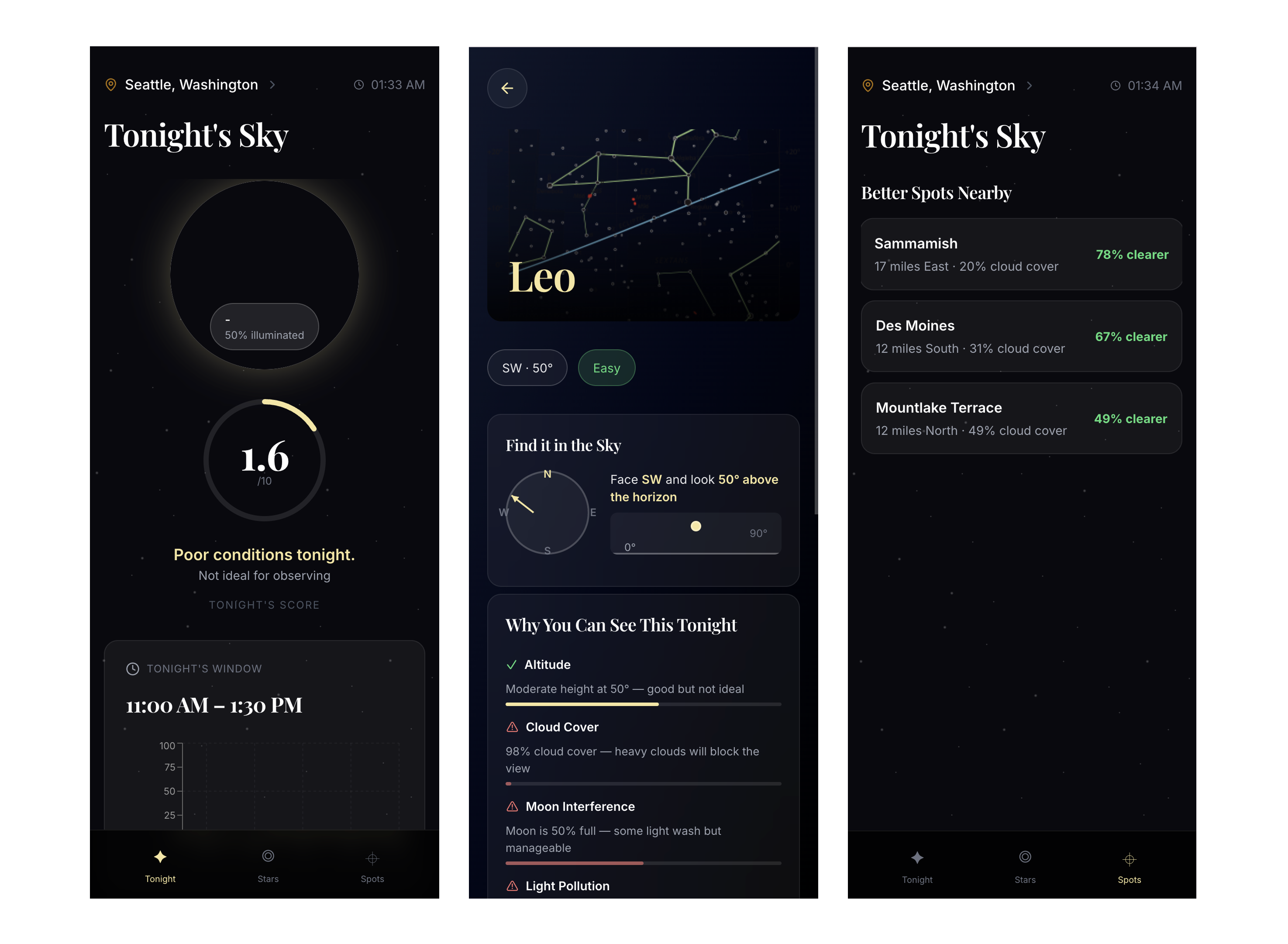
Find It in the Sky. Tap a constellation, get a compass-based direction and altitude. "Look Southeast, 35° up." This is the feature that turns the app from informational to actually useful. Without it, you're just reading about stars you can't find.
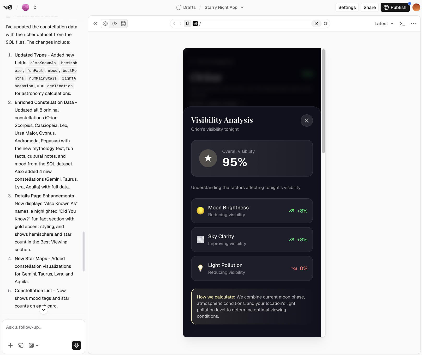
Visibility Breakdown. Instead of just showing a score, explain why. Moon brightness: -20%. Sky clarity: +30%. Light pollution: -10%. Users trust systems more when they understand the reasoning, not just the result.
Where Should I Go? Compare your current location against nearby spots. "Drive 15 min, +40% more visible stars." This shifts the app from passive to helping users make a real decision.
Everything else got cut. I didn't want to build a constellation-tracking social app or add gamification on top of an already clear purpose. What I had was enough, and overcomplicating it without adding value wasn't something I was willing to do.
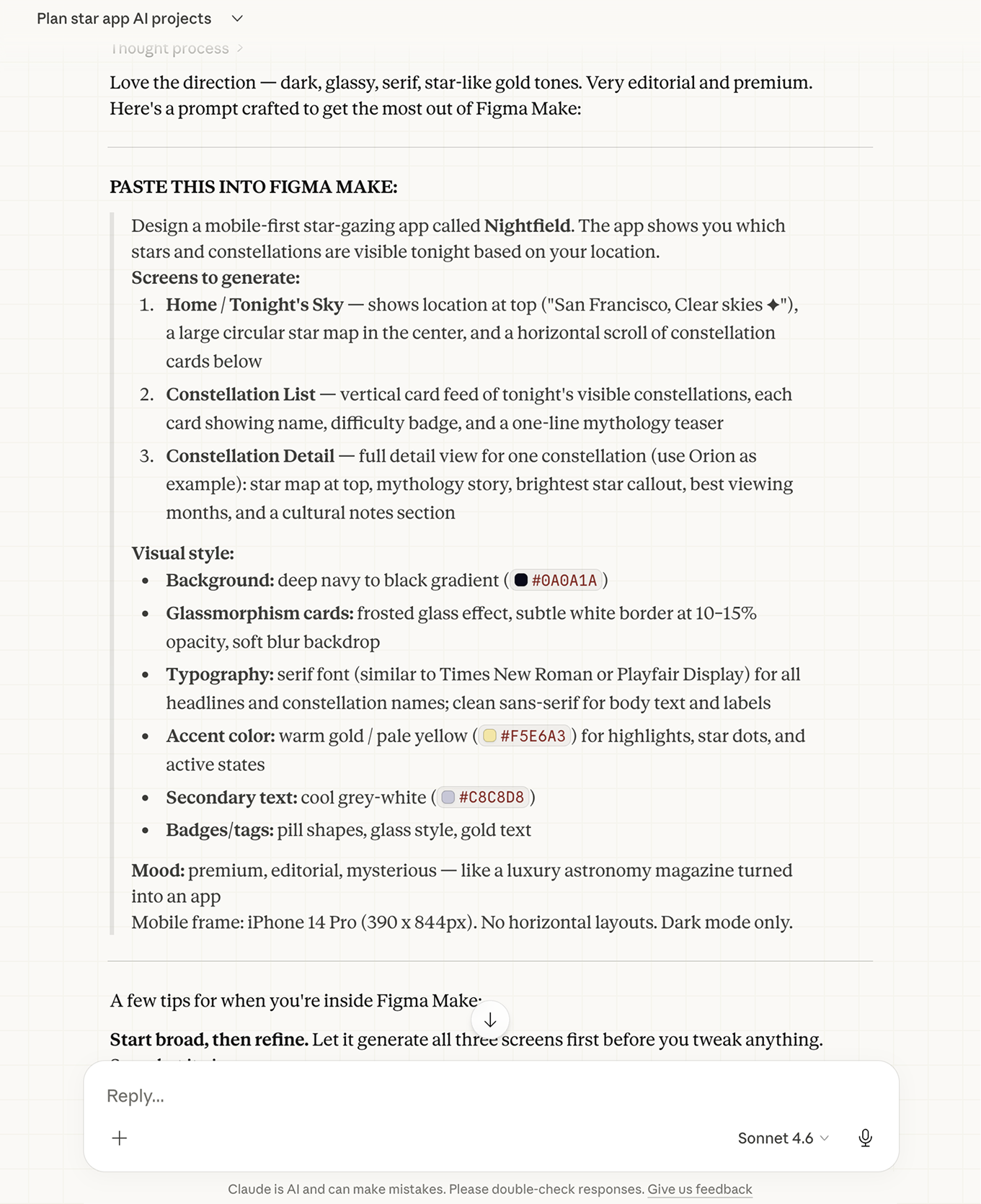
I used Claude to write the Figma Make prompts, framing the app's mood, data fields, and purpose before touching anything visual. The AI got the layout structure right on the first pass. Spacing and color needed manual work. I adjusted both until it felt less "tech dashboard" and more "night sky."
"Feature scoping is real design work."
"AI gave me a long list. Product thinking is knowing what's valuable and what's not."