Password Protected

This case study is password protected. Please enter the password to continue.

Work About Resume Email me
← Back to work
Government · Design Systems · 2025
USA Staffing Design System
Building the first design system for a federal HR platform — from a fragmented, inconsistent product to a scalable, accessible foundation.
Role
Product Design · Systems · Advocacy
Scale
USA Staffing · Design + Engineering
Year
2025
Color tokens
info
warning
error
success
7 greens found
→ standardized to
Component — Button
Primary
Secondary
Disabled
Spacing tokens
xs
sm
md
lg
xl
Context

When I joined USA Staffing, I was the first designer on the team. Before, most design decisions were made by business analysts and developers.

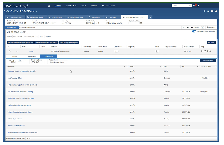
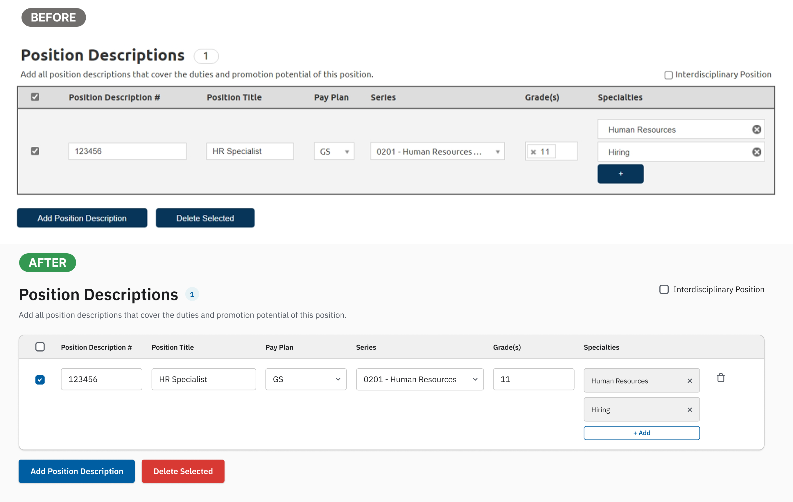
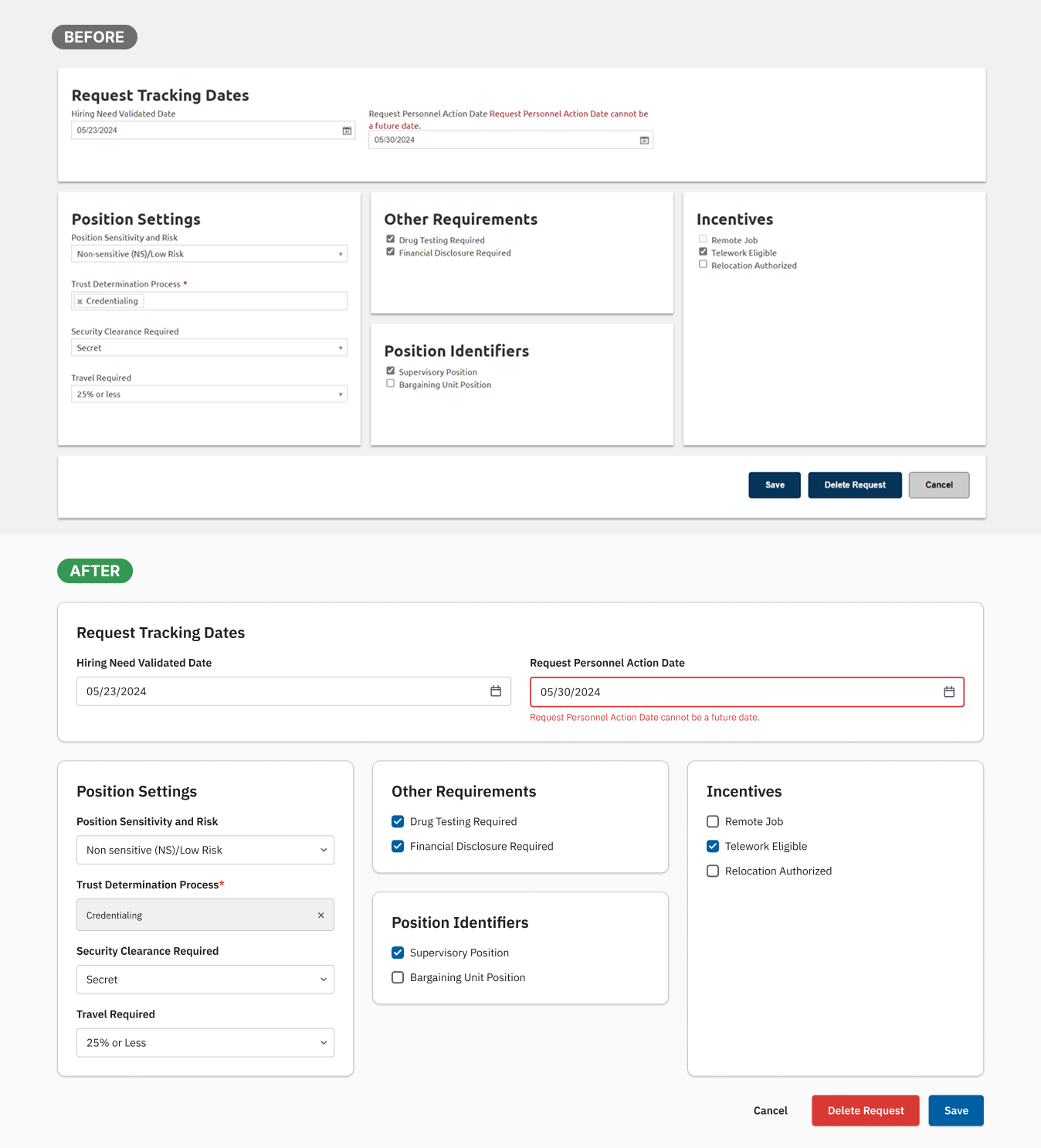
There was no shared system. Components were built manually every time, from scratch. No tokens, no documentation, no naming conventions. Every screen was slightly different from every other screen.

This was the first gap I identified. I proposed building a design system, got alignment from my product owner, and took it to leadership, presenting to product managers, engineering leads, and scrum team leads.

I focused on one argument: consistency isn't just a design problem. It slows down development, creates accessibility risk, and makes the product harder to trust.

Leadership approved, and I started building it.

Problem

I started with an audit. The findings were worse than expected.

The product had no visual language. Every team had made slightly different decisions, and those decisions had accumulated over years into a fragmented, inconsistent interface.

Existing USA Staffing UI showing visual inconsistency

This is a single screen. Three primary buttons. All different sizes, different weights, different positions. No visual hierarchy. No consistent rules. A user has no way of knowing which action matters most, because everything looks equally important. That's not a styling issue. It's a UX failure.

What the audit found

Audit finding — 7 different success green colors found across the product

The "7 greens" were a clear example. With no standardized token, the system was using 7 different shades of green for success states across the product.

The audit also found multiple button styles and sizes with no clear hierarchy, tables and data layouts that were slightly different in every instance, and spacing that had no system behind it.

Developers were either reusing old components or creating new ones each time. Neither approach was sustainable. And because components were being built manually, there was no guarantee they met Section 508 accessibility requirements.

Goal

Create a scalable design system that standardizes the UI, improves efficiency for both designers and developers, and supports Section 508 compliance, built to work inside a federal environment.

Approach

I approached the build in three phases, sequenced deliberately. Structure before scale.

Phase 1 — Audit

Mapped the existing product to find what existed, what was duplicated, and what needed to be standardized. This became the foundation for prioritization. I wasn't guessing at what to build first. I was responding to evidence.

Phase 2 — Foundation: Tokens

Before touching any components, I defined the token layer: color, typography, and spacing. Getting this right was important so I could scale components later without introducing new inconsistency.

Token system — color, typography, and spacing tokens

Phase 3 — Components and Guidelines

With tokens established, I designed and documented core components: buttons, forms, and tables. These were the three most inconsistent areas the audit identified. Each component came with usage guidelines and a simple change management process to track updates over time.

Design system change documentation
Key Decisions

Build on USWDS — but extend it

After auditing different design systems, I chose the U.S. Web Design System as the foundation. It's the federal standard, it already meets compliance requirements, and it's widely understood across government teams. But USA Staffing is a complex product with workflows the USWDS wasn't designed for. Where the standard didn't cover our needs, I extended the system with custom components and patterns, using the same token logic.

Core components — button variants and states from the design system

Tokens before components

I could have started with the most visible problems: the buttons, the tables. But fixing components without fixing the token layer underneath would have meant rebuilding them again when the foundation was ready. Sequencing matters. I chose slower progress up front for cleaner scale later.

The Work

I applied the design system to key screens, replacing manually-built components with standardized patterns and tokens. The before and after shows the difference a shared foundation makes, not just visually, but in how the interface communicates structure and hierarchy.

Table redesign
Table component redesigned with the new design system
Form redesign
Form component redesigned with the new design system
Collaboration

Building a design system in isolation doesn't work. I worked closely with engineers to align on naming conventions. The same token names used in Figma had to map directly to what developers referenced in code. Shared naming meant fewer translation errors and faster handoff.

I also ran sessions with the design team to walk through the components and guidelines, making sure the system was actually usable. Not just a Figma file that sat untouched.

Impact
~20–30%
Faster design for new screens, from reusable components and tokens
~30%
Less design-to-dev handoff meetings, from shared naming and standardized patterns
1st
First design system in the product's history, adopted in development before my departure

The system was adopted in development. Consistency improved across screens, new feature design became faster, and the team had a shared language between design and engineering for the first time.

Reflection

If I had more time, I would have expanded the component library beyond the core set, improved governance and documentation for long-term maintenance, and tracked adoption more formally across teams.

What I'm most proud of isn't the components themselves. It's that there is a system now. I identified the gap, made the case to people who didn't ask for it, and built something that the team was actually using when I left.

← Workload Management Dashboard Next project eOPF →